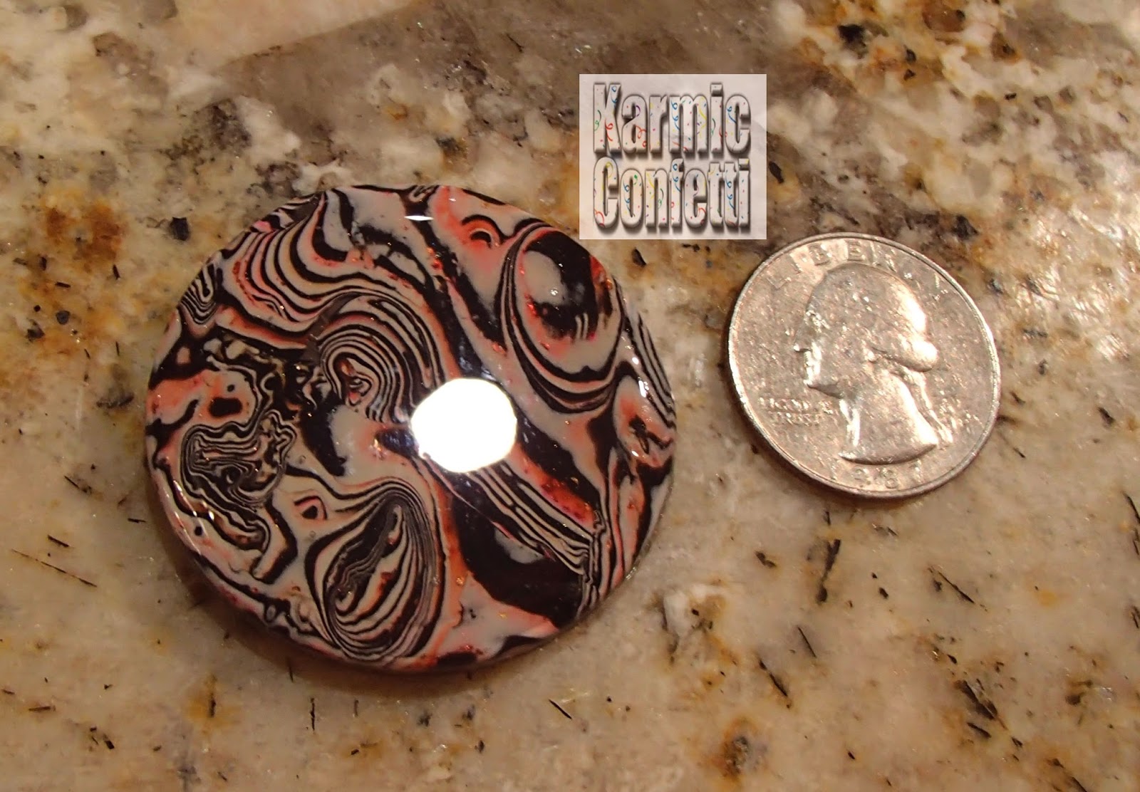
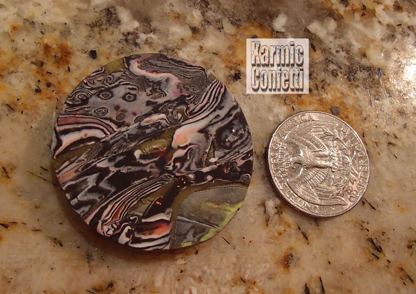
Thought maybe you'd like to see what I did with the metal I etched the other day. If you haven't read the post it is the last one I wrote and it is also located on the right side of the page in the popular articles section. I have GOT to find a good source of cheap copper! The pieces I used spoiled me because all four sheets were $4.99 on clearance, down from $19.99. I wish I had bought more, now! (I do have two more packages I found in my stash that I am very happy about! I am saving them for when I do a laser print of a photograph...;) ) I hear that the world is actually running out of copper, though, so cheap copper may be a pipe dream!
I didn't have any "spare" copper that I wanted to use to back up these little experiments, though so I ended up using of my favorite metals - sheets of aluminum flashing that I get at Home Depot (10 5x7" sheets for less than $3!) to back them with. I colored them with some dark colors of alcohol ink to blend them in with the patina'd copper a bit. I tried making rivets from copper wire but had no luck, so I dug out my eyelets and my Big Bite to punch the metal out and set the eyelets. (I saw a package today of eyelets and grommets at the craft store - the grommets go on the back to stop the ragged edges on the back of eyelets when you set them - I have to find out more about them! If you want to use these for jewelry, it's a must to have a smooth back! The ones I saw were a little expensive but if you want quality sometimes you have to pay for it. ;)) I already had my coupon used for a new product I am going to use for Christmas cards this year...it's a foiling pen and looks so cool! More about that another time....
I didn't have any "spare" copper that I wanted to use to back up these little experiments, though so I ended up using of my favorite metals - sheets of aluminum flashing that I get at Home Depot (10 5x7" sheets for less than $3!) to back them with. I colored them with some dark colors of alcohol ink to blend them in with the patina'd copper a bit. I tried making rivets from copper wire but had no luck, so I dug out my eyelets and my Big Bite to punch the metal out and set the eyelets. (I saw a package today of eyelets and grommets at the craft store - the grommets go on the back to stop the ragged edges on the back of eyelets when you set them - I have to find out more about them! If you want to use these for jewelry, it's a must to have a smooth back! The ones I saw were a little expensive but if you want quality sometimes you have to pay for it. ;)) I already had my coupon used for a new product I am going to use for Christmas cards this year...it's a foiling pen and looks so cool! More about that another time....
 |
| I found out that both the 34g copper and the aluminum flashing are thin enough to cut with a scrapbooking corner punch I have for making Christmas cards so I rounded the edges of both the copper and aluminum with it. |
As I said, I tried to make my own rivets and messed up the upper corner of the mermaid, so I ended up using eyelets with it. Now I have something to hang it from though. I have some copper chain I can use. :)

 |
| I love the stamp I used to make this. I've used it with my fused glass, too. Oddly enough I ran across this exact same etching on another persons etching post. :) |
I decided to make a bracelet out of this thin strip. I cut it with some decorative scissors and gave it a scalloped edge so I backed it with aluminum to prevent sharp edges. It isn't very strong, being that it is backed with aluminum but I now have a prototype to make more. ;) You can't see it but once again I used eyelets to fasten the two strips together. It is quite comfortable to wear though.

 |
| I have had this stamp forever! It's a four sided one and I love all four. :D |
 |
| Like I said, this isn't a perfect etch but it's really cute, isn't it? I would hang it on a Christmas tree. :) |
 |
| The etching on this actually looks better in person. Same design as the other bracelet with a Christmas theme! :) |
Someone on one of my Facebook metal groups asked about the Ranger patina paints or inks that exist. I decided to try them on some old diecut embossed pieces of my aluminum flashing that were laying around. The brown one in the center is actually alcohol ink like I used on the pieces above. I sanded them with sme fine grit sandpaper once they were dry. There is a real shine to these inks. I did not use the gold that is in the set I have, yet. Jury is still out on what I think of them on the kind of metals I create, though...I did see someone use them for etched copper earrings and they looked really nice.
 |
| These are not etched. They were run through my Big Kick with a few Vintage embossing plates. |
 |
| I don't know if you can tell how hard this was to cut from this photo. I had to use a file to smooth the edges after this. I think I need to ask my husband to do this stuff for me at this point! :P |
The next photo is after etching. I really love the way they came out! I decided to break down and went to Radio Shack for their ferric chloride etchant and used that instead this time because the copper is so much thicker. I got a cheap fish tank pump and taped it to the side of the container holding the ferric chloride so the vibration would help the etching and left it in the solution for about two and a half hours. I think I may add the citric acid to it and see if it etches better with it next time. Here are some notes I took from someone on Facebook about this topic...using citric acid along with FC. I wish I could give that person credit but I forgot to get their name! Anyway, the method using citric acid is called The Edinburgh Etch and is supposed to be safer than using plain old ferric chloride.
"Recipe for Citric Acid Etching Solution: Place 3/4 cup of warm water in a glass or plastic container that has a non-metallic lid (an old, clean, mayonnaise jar# works) and slowly add 1/4 cup of citric acid power. Stir until dissolved. That's it. You can't make Edinburgh Etch by just sprinkling citric acid powder into your ferric chloride, you have to dissolve it first. To make EE, add one cup of citric acid solution to four cups of ferric chloride and stir to make it homogenous. <snip> There are several videos-just search for Keith Howard. He was instrumental in encouraging the chemists at the U of Edinburgh to develop a safer etchant." Apparently Keith Howard wrote a book called Non-Toxic Printmaking with this recipe in it in the late 1980s or 90s
"Recipe for Citric Acid Etching Solution: Place 3/4 cup of warm water in a glass or plastic container that has a non-metallic lid (an old, clean, mayonnaise jar# works) and slowly add 1/4 cup of citric acid power. Stir until dissolved. That's it. You can't make Edinburgh Etch by just sprinkling citric acid powder into your ferric chloride, you have to dissolve it first. To make EE, add one cup of citric acid solution to four cups of ferric chloride and stir to make it homogenous. <snip> There are several videos-just search for Keith Howard. He was instrumental in encouraging the chemists at the U of Edinburgh to develop a safer etchant." Apparently Keith Howard wrote a book called Non-Toxic Printmaking with this recipe in it in the late 1980s or 90s
 |
| Before adding patina. I bought the Beadsmith stuff - what a waste of money! Turned really black and then completely fell off, leaving shiny metal behind! :P |
This is from one of the other packages of the thin metal that I had in my stash. I left it in a little too long, I think! But it really kept a lot of detail. This is two different stamps, btw, in case you are wondering why the right and left seem so different! This one has finer details compared to the others. I used a Stazon stamp pad alone instead of using Versamark and embossing powder. It gave a much finer, more detailed etch.

The picture with the two sets of trees is for comparison. The one on the bottom is the original one I etched with my vinegar/peroxide/salt mixture. The top one is the ferric chloride. I left it in a little too long, trying to get a deepish etch, and it started eating a hole through the metal. I think I actually got a better etch with the first mixture! Maybe the ferric chloride is better for thicker items though...
The top one is very thin and fragile now. ..These were both done with the same kind of metal to begin with, just the etchant was different...I also discovered I have to make sure to use detail embossing powder instead of whatever the heck I was using, because the tree branches are much thicker than they were in the first etch. Another tip I just discovered on my FB etching group is that if you use embossing powder to etch and are having a hard time removing it, and don't want to sand because your etch is too delicate, you can use lacquer thinner...great tip, because I could NOT find out that information anyplace! :D Many thanks to Ruth Shapiro!
 |
| Still pretty. :) |
And then, my favorite of the experiments! These are slices of a copper pipe I cut a few months back when I was making copper bezels for my polymer clay with them. I rolled them in stamp pads and also used Sharpie to put simple designs on by hand. It wasn't even Sharpie, it was el cheapo red permanent marker from the Dollar Tree! Worked great...those are the ones with lines on them. I also used my Stazon stamp pad to edge all of the pipe slices as well as the flat pieces. (You edge them to protect the edge so it won't get etched and ragged from the etchant.) Seemed easier than using a Sharpie because my hand kept slipping when I tried. :D And it was! They were perfectly smooth after etching. You will see these again, and soon. :) Watch this page!
 |
| Rolling them on my stamp pad was a pain! I put a dowel through them (I rolled them individually) and rolled them across the pad with it, but my hands were still quite black when I finished! :D |

Thanks for visiting and check back often. I have a new project in the works with RESIN that I am SO excited about! Come back soon now, y'hear? :D